

Footprints Maps for Business
A self-serve business portal enabling local partners to manage travel app listings.
https://business.footprintsmaps.com.au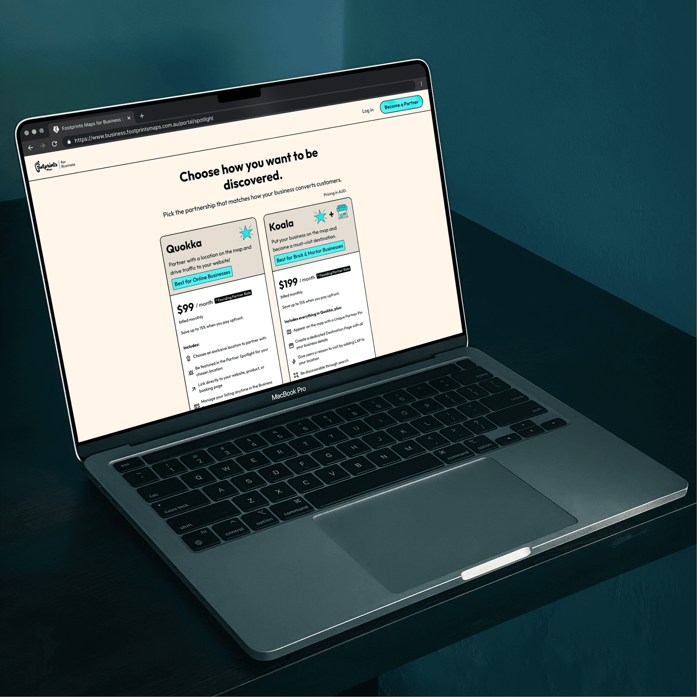
Designing the Footprints Maps app naturally led to the next challenge: creating the platform that powers it. Every business profile, Spotlight, opening hour and image shown to travellers first needs to be created somewhere. That somewhere became Footprints Maps for Business.
The goal was simple. Any business owner, regardless of their marketing or technical experience, should feel confident creating and managing their presence inside the Footprints Maps app.
A shift in how the product was designed
This project also marked a major shift in my design process. Rather than designing the entire system in Figma and handing it over, I used it as an opportunity to explore an AI-assisted workflow using Cursor and a Next.js codebase.
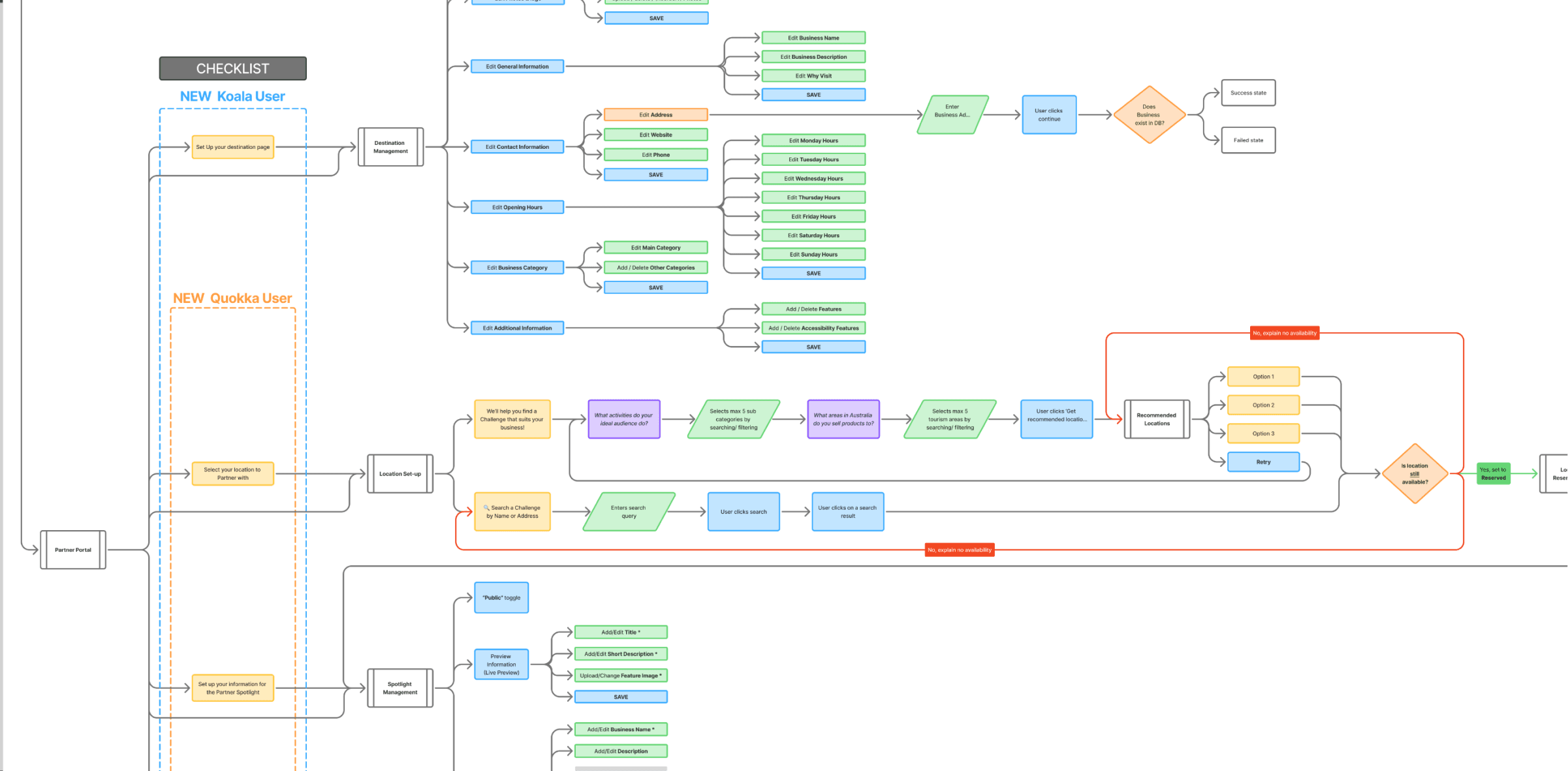
I still began with traditional UX foundations. I mapped user flows, defined the information architecture, and refined wireframes to establish how businesses would interact with the platform. From there, I designed the initial portal homepage and a small set of key components in Figma to establish visual direction.
Once the foundations were clear, I moved directly into Cursor. I set up the Next.js project and defined the design system through tokens, including colour, spacing, typography, and radii. This became the single source of truth for the interface as it was built.
From that point onward, the product was designed and built in parallel. Instead of finalising everything in static mockups, I designed components directly in code, iterating in real time with AI-assisted development. This allowed the interface to evolve as it was being implemented, rather than being translated from design to build after the fact.
Designing this way gave me a level of control I hadn't experienced before. Rather than relying on handoff and interpretation, I could refine the experience throughout implementation. Micro-interactions, animations, responsive behaviours and edge cases were all considered in context, which resulted in a more cohesive and polished final product.
UX approach and product thinking
The core design challenge was making advertising management feel approachable for regional businesses. Many users would have no formal marketing experience, limited digital assets, and little time to learn complex systems. The platform therefore needed to feel closer to creating a simple profile than configuring an advertising product.
To support this, I researched similar products including Shopify, Squarespace, Google Business Profile, and most heavily, TripAdvisor. While we didn't conduct formal user interviews, we combined competitive analysis with client feedback to shape a flow that felt familiar, guided, and low-friction.
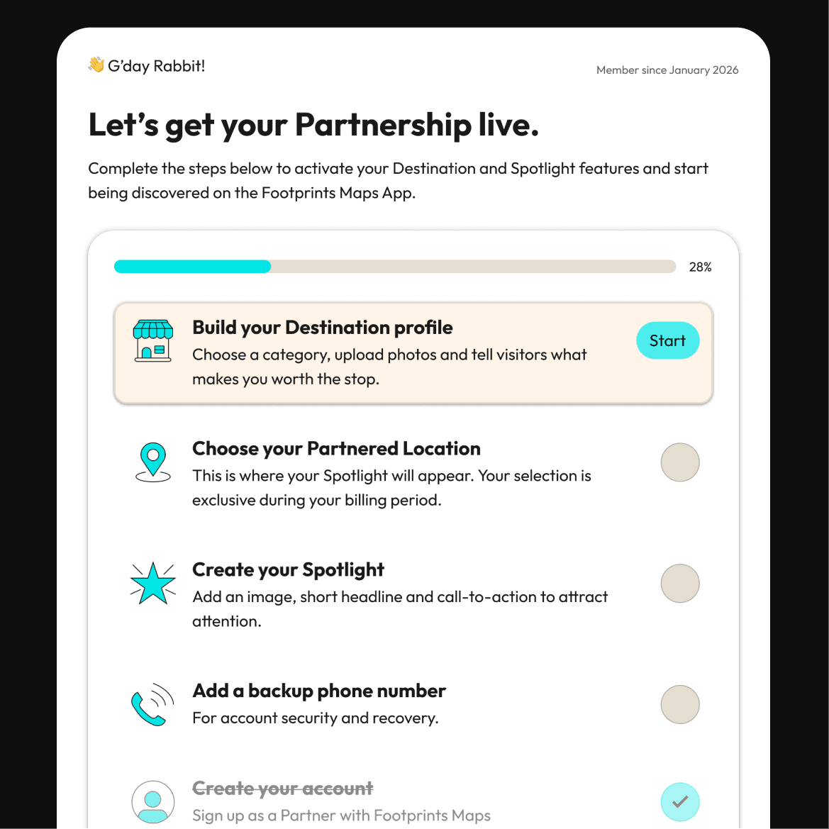
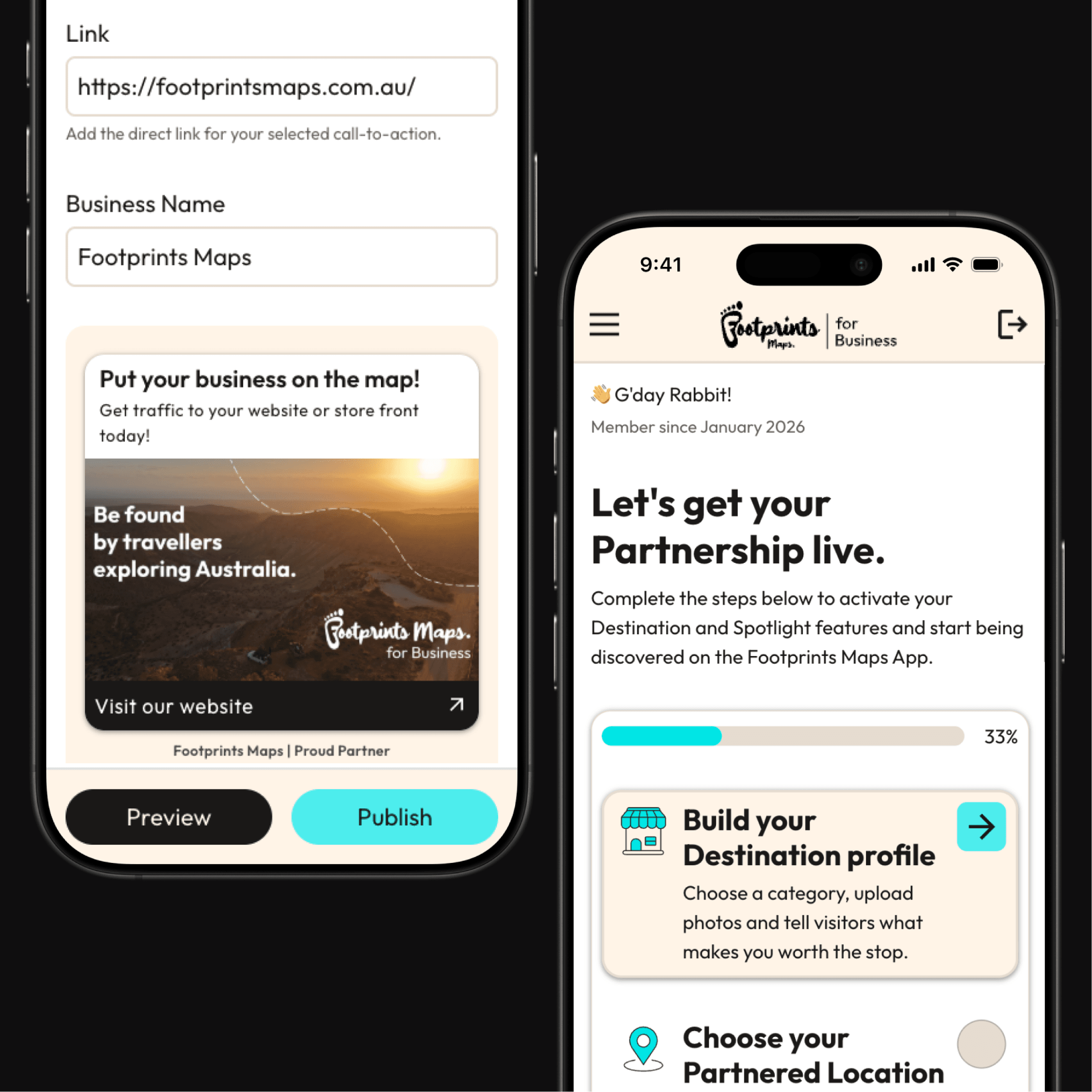
A key principle throughout the design was encouraging completeness without overwhelming users. Instead of presenting a blank dashboard, the home screen introduces a setup checklist that breaks onboarding into small, achievable steps. Some items are pre-completed during account creation, creating immediate momentum and a sense of progress.
Alongside this, a profile strength indicator rewards businesses for completing their listing. This not only encourages richer data for travellers but also gives businesses clarity on how to improve their presence over time.
The hardest problem to solve
One of the most complex UX challenges was helping users understand the difference between a Destination and a Spotlight. Internally, these were referred to as Koala and Quokka tiers, but the naming created confusion when discussing actual functionality.
To solve this, I introduced Destination and Spotlight as the primary product-facing terms, while still allowing the Koala and Quokka tiers to exist in the background. This helped separate the what the feature does from how it is packaged, making the system easier to understand.
I reinforced this distinction through a set of supporting illustrations used across both the landing page and portal, helping users quickly understand what each option meant before they began setup.
Key feature: Live preview
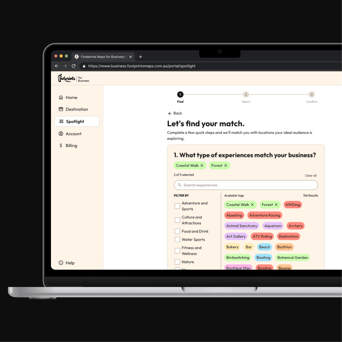
The feature I'm most proud of is the live Spotlight preview. As businesses build their promotion, they can immediately see how it will appear inside the Footprints Maps app. This creates a tight feedback loop that removes uncertainty and gives users confidence before publishing.
Outcome
The result is a business portal that turns a potentially complex advertising system into a guided, self-managed experience. Businesses can understand what to do, complete setup in manageable steps, and maintain control over their listing without ongoing support.
By focusing on clarity, progressive onboarding, and real-time feedback, the platform improves both sides of the marketplace: businesses can confidently manage their presence, and travellers receive richer, more complete information inside the Footprints Maps app.
Designing the Footprints Maps app naturally led to the next challenge: creating the platform that powers it. Every business profile, Spotlight, opening hour and image shown to travellers first needs to be created somewhere. That somewhere became Footprints Maps for Business.
The goal was simple. Any business owner, regardless of their marketing or technical experience, should feel confident creating and managing their presence inside the Footprints Maps app.
A shift in how the product was designed
This project also marked a major shift in my design process. Rather than designing the entire system in Figma and handing it over, I used it as an opportunity to explore an AI-assisted workflow using Cursor and a Next.js codebase.
I still began with traditional UX foundations. I mapped user flows, defined the information architecture, and refined wireframes to establish how businesses would interact with the platform. From there, I designed the initial portal homepage and a small set of key components in Figma to establish visual direction.
Once the foundations were clear, I moved directly into Cursor. I set up the Next.js project and defined the design system through tokens, including colour, spacing, typography, and radii. This became the single source of truth for the interface as it was built.
From that point onward, the product was designed and built in parallel. Instead of finalising everything in static mockups, I designed components directly in code, iterating in real time with AI-assisted development. This allowed the interface to evolve as it was being implemented, rather than being translated from design to build after the fact.
Designing this way gave me a level of control I hadn't experienced before. Rather than relying on handoff and interpretation, I could refine the experience throughout implementation. Micro-interactions, animations, responsive behaviours and edge cases were all considered in context, which resulted in a more cohesive and polished final product.
UX approach and product thinking
The core design challenge was making advertising management feel approachable for regional businesses. Many users would have no formal marketing experience, limited digital assets, and little time to learn complex systems. The platform therefore needed to feel closer to creating a simple profile than configuring an advertising product.
To support this, I researched similar products including Shopify, Squarespace, Google Business Profile, and most heavily, TripAdvisor. While we didn't conduct formal user interviews, we combined competitive analysis with client feedback to shape a flow that felt familiar, guided, and low-friction.
A key principle throughout the design was encouraging completeness without overwhelming users. Instead of presenting a blank dashboard, the home screen introduces a setup checklist that breaks onboarding into small, achievable steps. Some items are pre-completed during account creation, creating immediate momentum and a sense of progress.
Alongside this, a profile strength indicator rewards businesses for completing their listing. This not only encourages richer data for travellers but also gives businesses clarity on how to improve their presence over time.
The hardest problem to solve
One of the most complex UX challenges was helping users understand the difference between a Destination and a Spotlight. Internally, these were referred to as Koala and Quokka tiers, but the naming created confusion when discussing actual functionality.
To solve this, I introduced Destination and Spotlight as the primary product-facing terms, while still allowing the Koala and Quokka tiers to exist in the background. This helped separate the what the feature does from how it is packaged, making the system easier to understand.
I reinforced this distinction through a set of supporting illustrations used across both the landing page and portal, helping users quickly understand what each option meant before they began setup.
Key feature: Live preview
The feature I'm most proud of is the live Spotlight preview. As businesses build their promotion, they can immediately see how it will appear inside the Footprints Maps app. This creates a tight feedback loop that removes uncertainty and gives users confidence before publishing.
Outcome
The result is a business portal that turns a potentially complex advertising system into a guided, self-managed experience. Businesses can understand what to do, complete setup in manageable steps, and maintain control over their listing without ongoing support.
By focusing on clarity, progressive onboarding, and real-time feedback, the platform improves both sides of the marketplace: businesses can confidently manage their presence, and travellers receive richer, more complete information inside the Footprints Maps app.